
Have you decided to create outdoor advertising layout by yourself? Great! We will give you some advices how to create an impressive, acting advertisement. Outdoor advertisement is one of the most abilities and skills requiring environment. We just repeat a few standard advices. Use them or break all the rules, but remember the words of David Bernstein:
"The only thing that really matters is the idea. The bare, simple, idea."
TIME. People look at standard-size advertisement just 2-3 seconds. During this time we are able to understand only 5-7 words. Therefore, your advertising message should be short and simple.
PURPOSE. Think about it, what is your main purpose of the campaign:
- Promote brand awareness
- Offering immediate action
- Remind about the company
- Informed of the product
- Specify the direction of the sale
VIEW. Use one image that would cause emotions. We propose to involve human, animal emotions, which may reflect the advertised product better than it’s own image. Sometimes precisely selected image can not only complement but also to change text and express basic advertising idea. Color of layout - one of the most important code, by which advertisement influences consumers emotionally and psychologically. We recommend to use clean, bright, contrasting colors, which should be the opposite of season colors (eg., the green color is not so bright at summer colors background, like at winter, snow background). Images with clear contrasts increase the attentiveness.
TEXT. Message text should be as short as possible. Long text is boring and mostly not even be able to read it during the outdoor advertising visibility duration. Here are some quick recommendations for text font:
- Bold font letters, which are located very close to each other, becomes illegible.
- Very thin or very thick font isn’t suitable to use over the colorful layout’s background.
- Too small distance between the letters visually connects them and impede reading of the text.
- Do not use only capital letters or italic font. It is difficult to read such text.
- Complicated, not standard fonts and too big contrast between the thinner and thicker
font elements is also difficult to read.
„The poster is finished when you can’t find a single element to remove“
R. Fleege
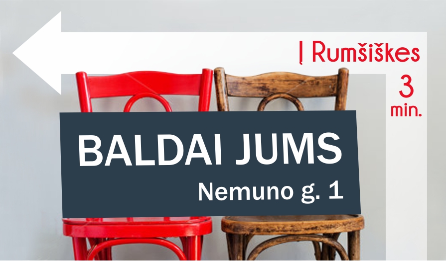
Here is an example how advertising layout design depends on advertisement size and it’s function. One advertisement - different layouts!
Flyer / 0.12 m
Poster / 1.2 m
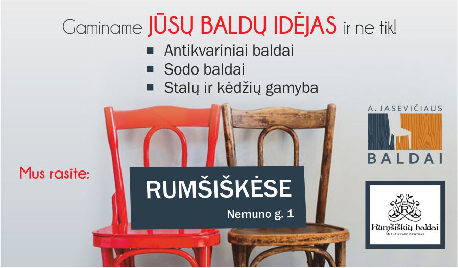
Outdoor advertising poster / 12
If you have any questions, have problem with generating ideas or to visualizing them, we are always ready to help you! We can create advertising layout, which will convey advertising messages and will be suitable for display at your chosen media. We invite you to visit our works gallery:
![]()