Colours are one of the most important aspects of outdoor advertising. It is very important to stand out and be better visible than your competitor. Each colour in the advertisement has a corresponding meaning in people's emotions. Creators of advertising express the effect of advertising with a special formula "AIDA" (formula of advertising), which defines the sequence of customer action: attention - interest - desire - action.
_EN.jpg)
The influence of colour in advertising is seen in aesthetic, symbolic, imaginative and sensory terms. This is one of the most important codes through which the information in the advertisement will be emotionally evaluated and psychologically influence the user. When developing an advertisement, the developer relies on colour psychology to stimulate the required user behaviour. Correct application of colours allows the developer to control the associations and form evoked in the image. The user, when seeing a certain colour, can sense the taste, perceive the weight of the object, even have the impression of scent.
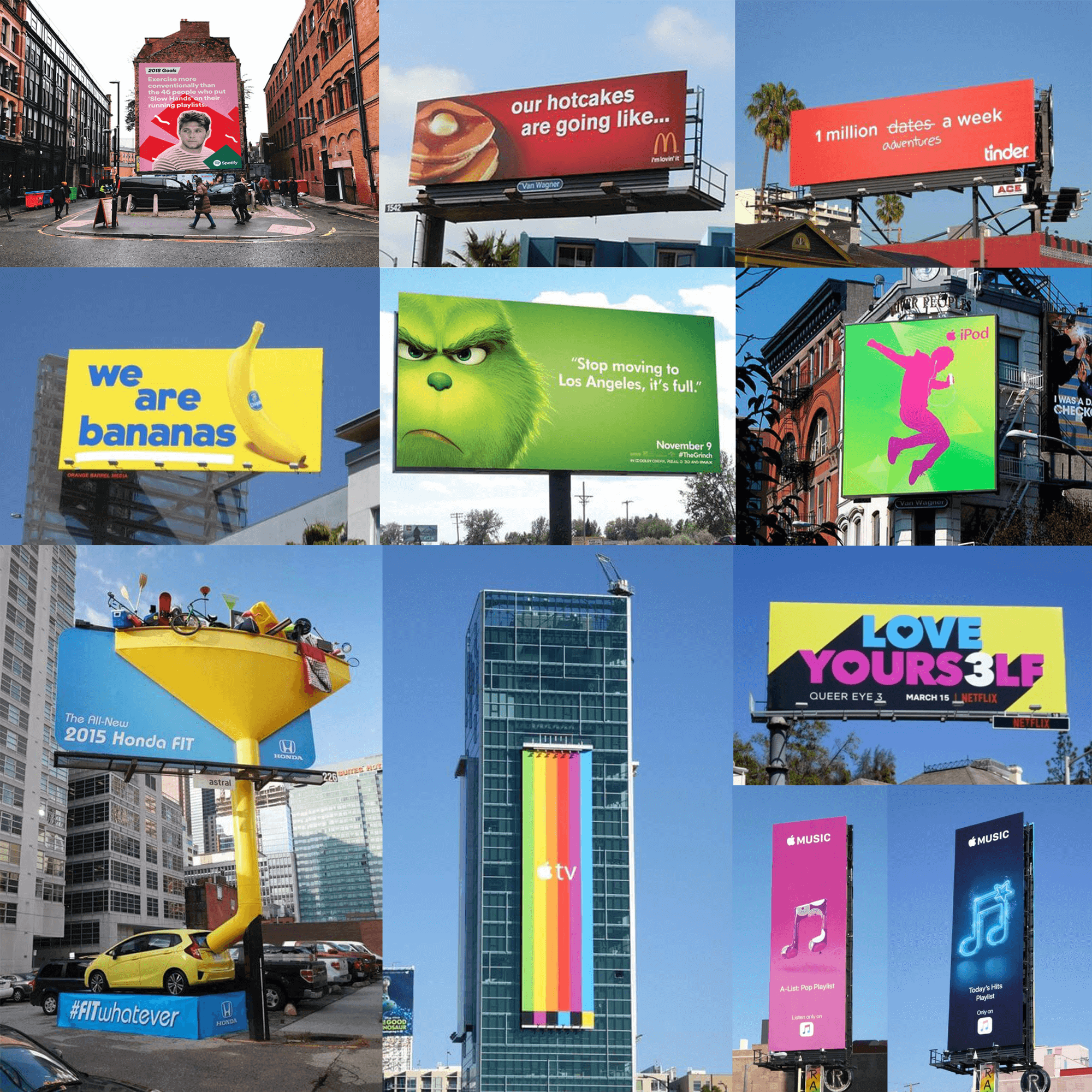
Contrast is very important in advertising, therefore colour combinations are often used. It is said that it is useful to use red and yellow; yellow and black; white, blue, and red; blue and yellow; black and yellow colours. Black letters on a yellow background, green or red letters on a white background are the most recognizable.
Major global companies like: McDonald's, Tinder, Apple, Netflix, Spotify and more often use bright colours in advertisements and not only stand out from the competitors, but also increase their sales.